A design refresh for the salacious British tabloid, The Daily Mail
Whether you love it or hate it, the Daily Mail knows how to lure readers. Here is my vision of a redesign to bring the newspaper into the the digital age.
Duration: 1 week
Role: UX Designer
Project Overview
For project 3 of Ironhack’s UX/UI bootcamp, I was tasked with a solo project of redesigning an already existing mobile app to better meet the 10 Usability Heuristic Principles of UI Design by Jakob Neilsen.
The app I chose was the Mail Online app because it was an app I have experienced personal difficulty with and I could think of many areas of improvement.
The following is a list of the heuristic violations that I found the most apparent and how I improved them.
Principle #4
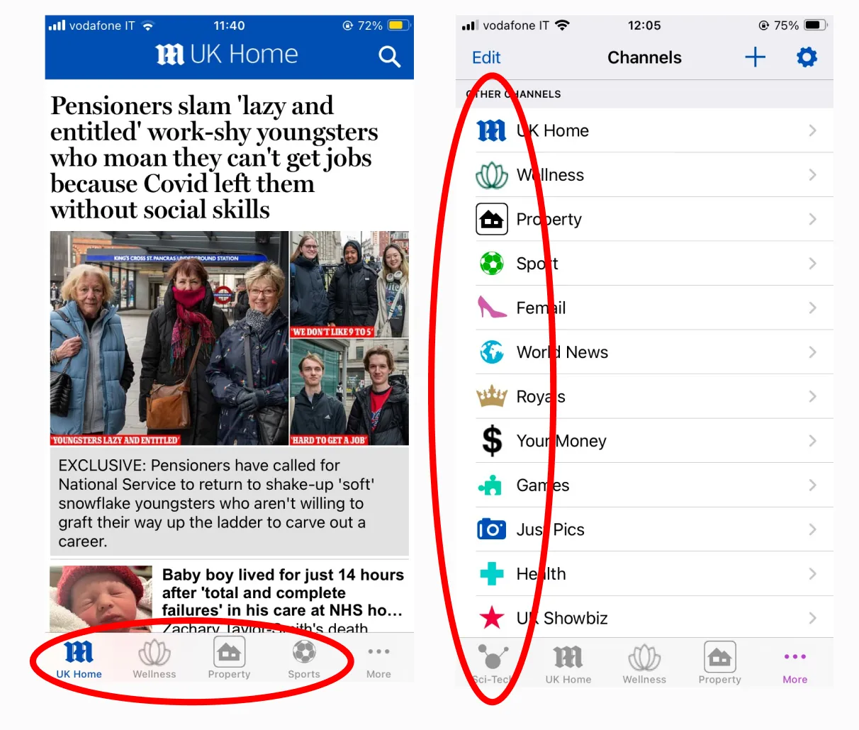
Consistency and Standards
I conducted a competitor analyisis of the industry. I included the apps Ten Percent Happier, Calm, and Headspace and discussed the strengths and weaknesses of each with the Beam Health Group team. After the presentation we determined that the goal of the brand identity was to convey tranquility throughout the platform. But it was important that we did not come off as pretentious. We were trying to strike a balance between being professional and yet approachable.
Solution
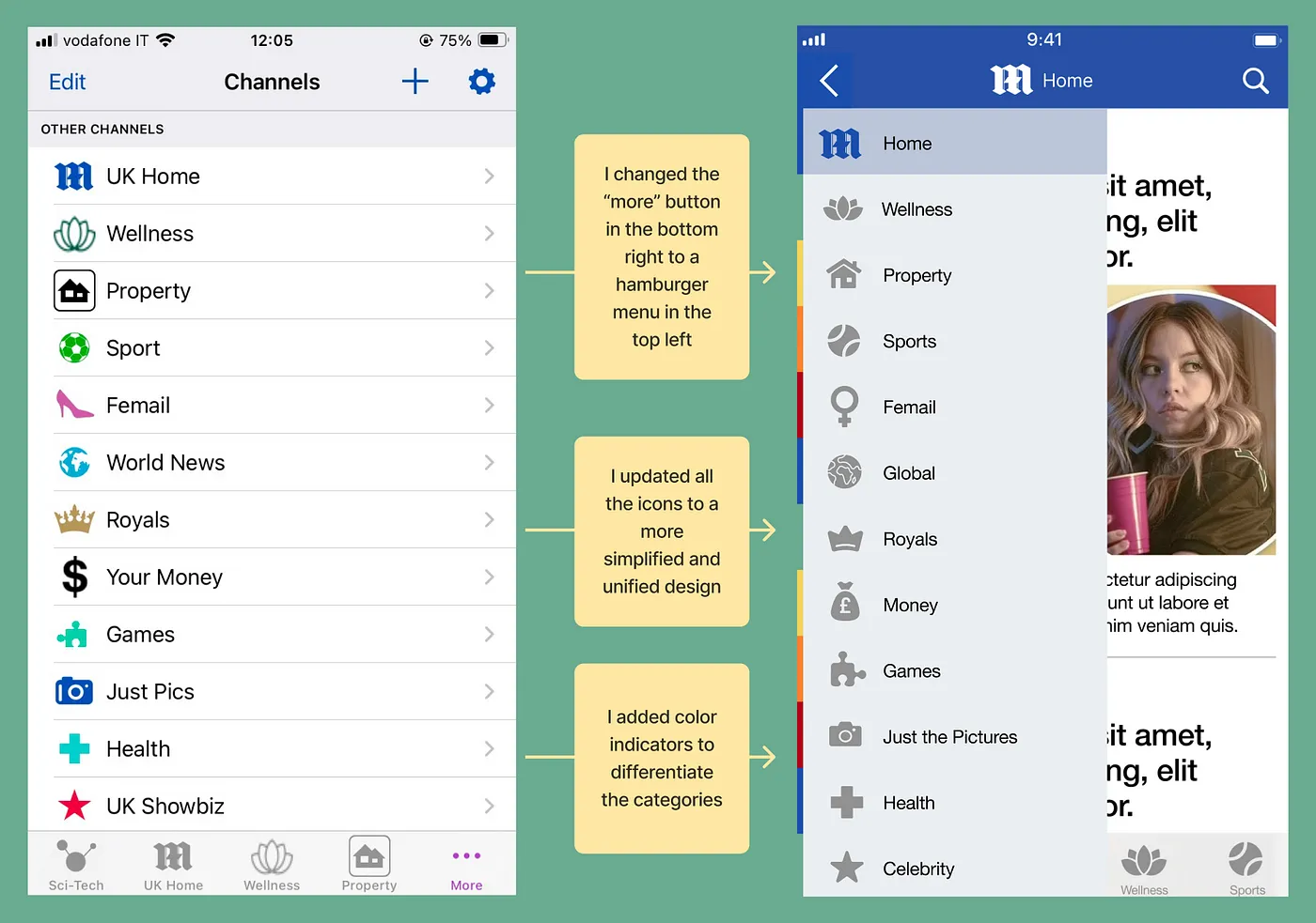
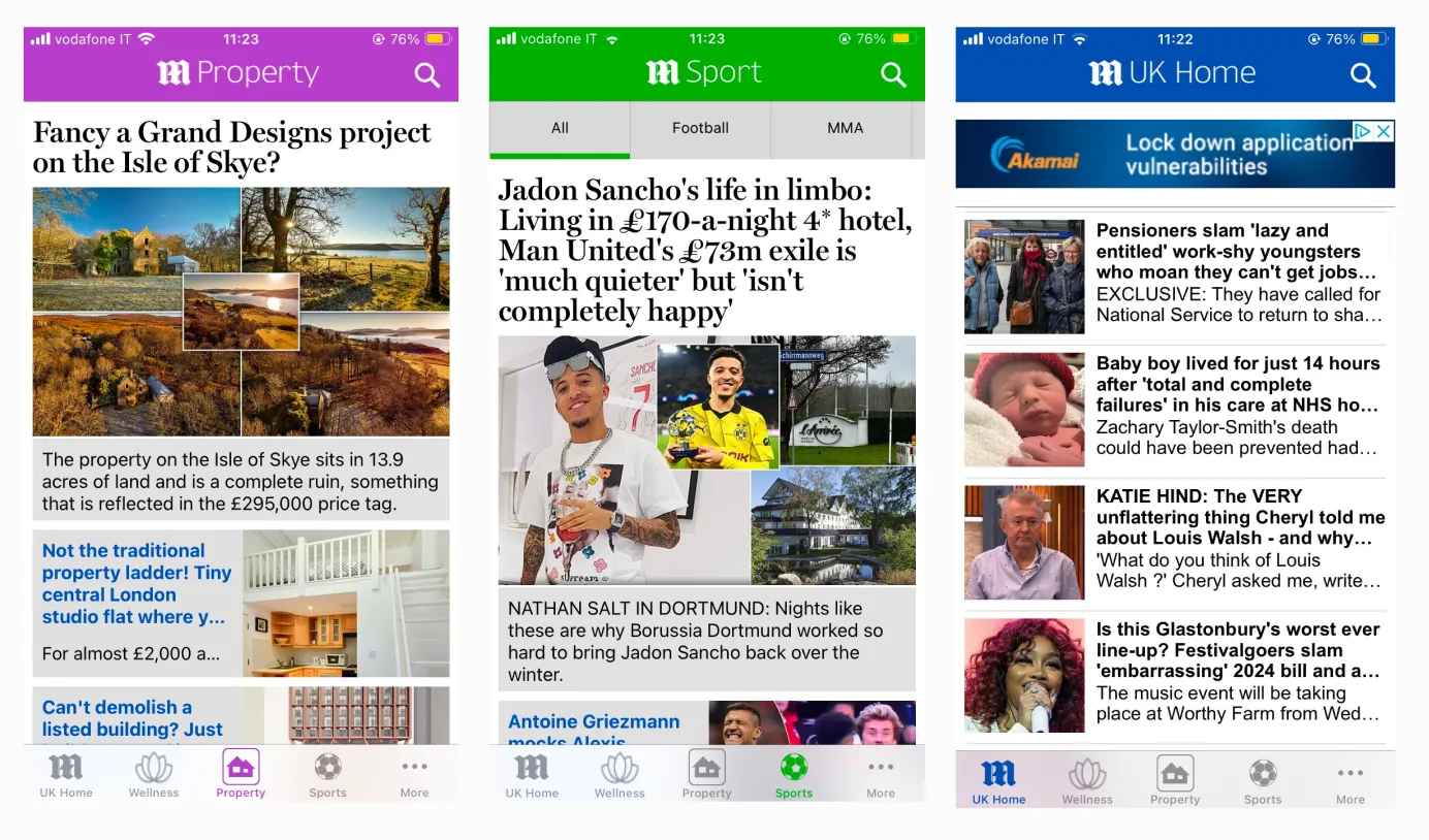
The solution that I came up with was to redesign the icons to be more simplified and unified. I also changed the “more” button in the bottom navigation page to a hamburger menu in the top left which I think is more understandable to the average user. Finally, I streamlined the colors to be more understandable with the different categories.
Principle #7
Flexibility and Efficiency of Use
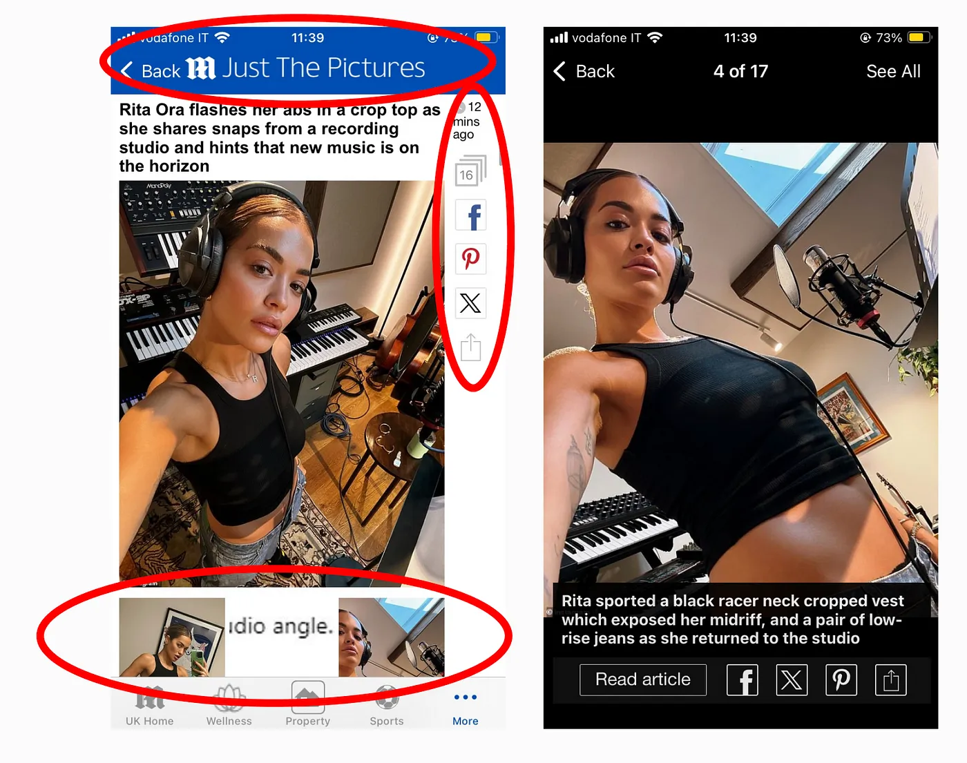
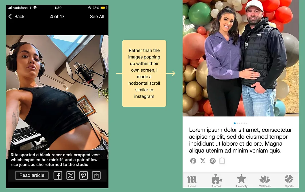
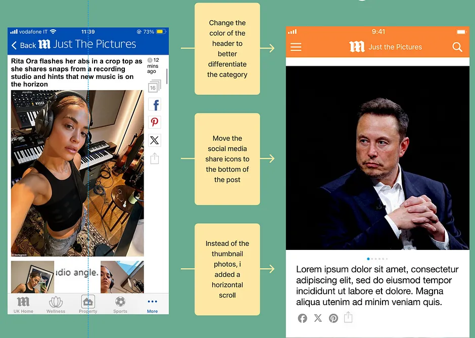
The “Just the Pictures” page is meant to display the articles in an Instagram-like photos-only style. But the experience is clunky and uncomfortable. The social media share icons are displayed vertically along the right side of the page next to the image and there are thumbnails along the bottom of the page displaying the slideshow. When you tap into an image, it appears on a new page with a black border, which disrupts the user flow.
Solution
My solution was to redesign the Just The Pictures page to present the photos in a horizontal scroll style, similar to what users have come to expect from apps like Instagram. I moved the social media share icons to the bottom of the post and changed the color of the header to differentiate the category.
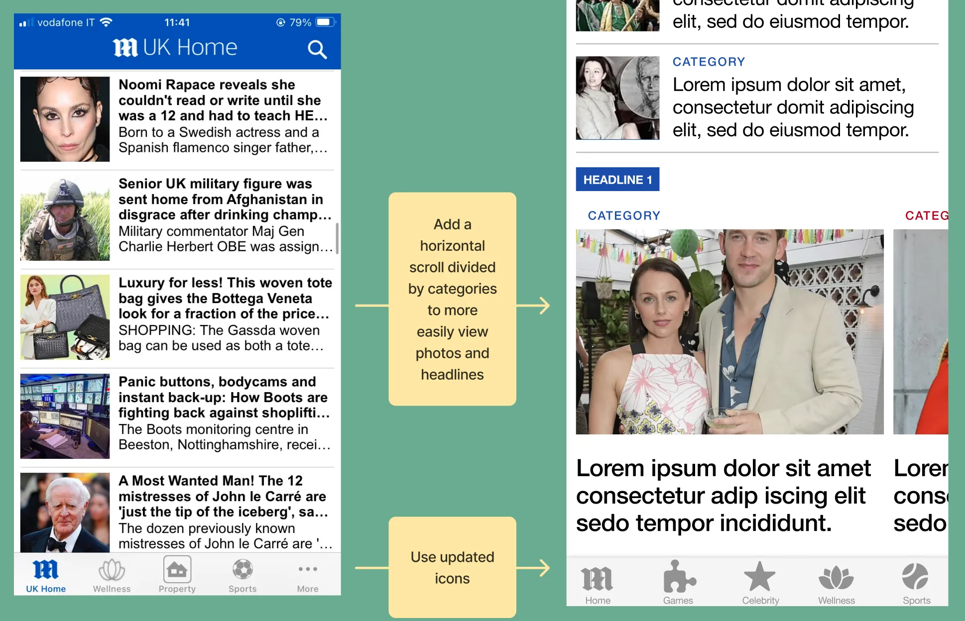
Principle #8
Aesthetic and Minimal Design
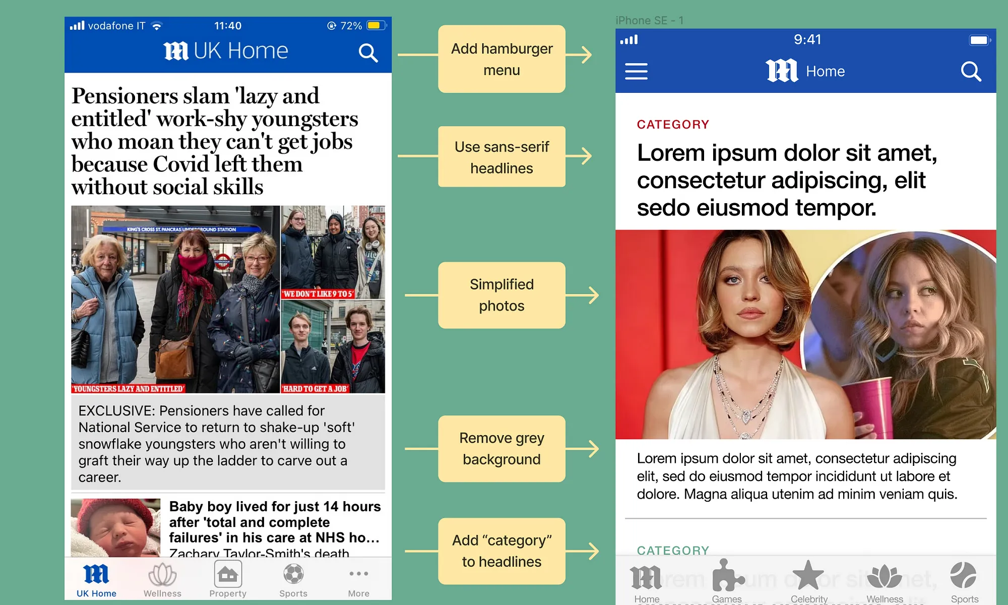
The app is overall cluttered and bursting with information. They use a photo layering technique that feels crowded, the pages have a strange color palette, and the text is too small.
Solution
The solution I came up with was to minimize the app. I decided to use a sans-serif font for the headlines, simplify the photos used, and add category headers to each headline corresponding to the menu icons' colors.
I also enlarged the text and added a horizontal scroll to view stories in a different way rather than endlessly scrolling vertically.
Style Tile
The style tile that I created for the app redesign is meant to display the new minimal aesthetic while still implementing the classic colors that the Daily Mail readers are accustomed to seeing.
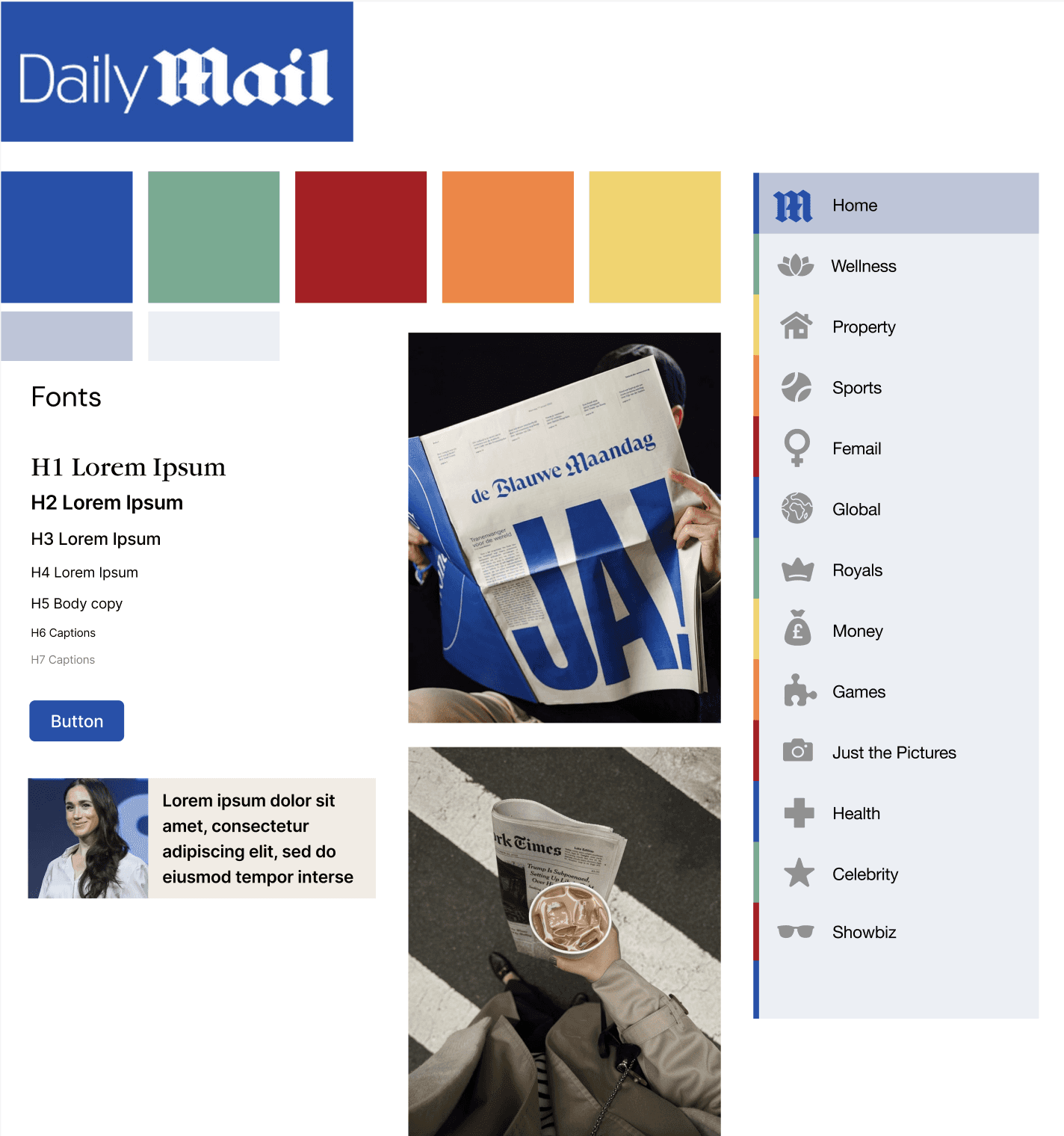

New Icons and Components
Created new icons and components for use on the app.
New Icons and Components
Created new icons and components for use on the app.
Hi-fi Prototype
Screenshots of the hi-fi prototype

Conclusion
After this project I felt more confident with my figma skills such as the usage of components and variants. Overall I enjoyed working on this project and I think the improvements were successful.